Key Data Science

RSS
Jun
27

Data Viz at the Museum

I recently spent a weekend getaway in the Low Countries. Saturday started with a trip to Zeeland mainly to admire sea defences and dykes. I also visited Watersnoodmuseum a fascinating place housed in four grey concrete blocks caissons, half-sunk in the ground at uneven angles. On Sunday I travelled to Antwerp. It was mainly to visit MAS museum, a must-see attraction for everyone. Great exhibitions, amazing architecture and spectacular views at the viewpoint.

One of the exhibitions – Antwerp a la carte – was a big attention-grabber for me. Firstly, it was about food and secondly, it contained some really neat data visualisations.

Compelling graphs that showed places where food came from to Antwerp over time:

“Above all else show the data” ― Edward R. Tufte

Go in and see Antwerp a la carte you won’t regret it!

Data Viz Comments Off on Data Viz at the Museum
Jun
19

Tableau Conference on Tour London 2017

The annual Tableau Conference on Tour in London (TCOT) took place from 5th to 7th June at Tobacco Dock.

Conference programme

Monday started with training sessions (which I didn’t attend) and a welcome reception in the evening. There was a live #makeovermonday event that also took place on Monday.

Tuesday began with a conference kick-off keynote by James Eiloart SVP EMEA at Tableau. It covered the future roadmap & new features. Some nice things coming out this year like Tableau Server for Linux. The day was full off breakout sessions, hands on training and customer presentations. There also was a ‘Data Night Out’ party.

Wednesday had a similar schedule. Except there was no party and instead we had IronViz Championship.

On both days Tableau Doctors were available – happy to help with small and big questions. One of the sponsors – The Information Lab – gave a few short but very informative talks during the brakes.


What I liked and what I would do differently.

I  enjoyed most of the sessions but there were a few that stood out. The hands-on training ‘Optimising Calculation Methods‘ was very insightful and informative. It was presented by Anna Flejéo and Tom Christian. It gave me a really good idea on how to decide when to use a calculated field, LOD expressions, or a table calculation.  The second one I really liked was ‘Faster Dashboards with Performance Best Practices‘ presented by Mrunal Shridhar. I also enjoyed the keynote session by David Spiegelhalter: ‘Dodgy Data, Naughty Numbers, and Shabby Statistics‘.  Very clever and entertaining. Not to mention IronViz Championship. Three contestants battled each other on the stage – who can make the finest visualisation in 20 minutes. To my great joy, @davidmpires won the competition.  Here’s David’s winning viz, impressive!

The conference was fun but there’s one thing I’d do differently. I’d go to more hands-on sessions. I attended 3 where I could go to 4. I was told that some breakout sessions were recorded and will be shared but the hands-on weren’t.  Well, that was my first TCoT – next time I’ll know better 🙂

A few tips for the next year
  • Make a plan A and a plan B for each time slot. Some sessions are really popular. One of the breakout sessions I attended was so full that people had to stand. Unfortunately,  the hands-on sessions were strictly limited and people were simply turned away.
  • If you really want to be is a session – come early.
  • You don’t need a laptop for the hands-on. They are provided, everything is setup and waiting for you.

 See you next year!

Tableau Comments Off on Tableau Conference on Tour London 2017
May
04

Data Visualisation Tools

On my return flight from the data driven holidays, I looked into the next Makeover Monday challenge. It was about Sydney ferries and I did a small Tableau dashboard which was meant to look like a ferry announcement poster.

See it for yourself here.

Once I got that out of my way I wondered how easy it would be to accomplish a similar task in other data visualisation tools out there (it was a 4 hours flight so 3.5 hours to spare). I had all the other tools on my laptop so why not turn whatever it is into tasks and get crackin’!

Tableau

I decided to create a second and simpler dashboard in Tableau that could be used as a baseline. It took me only 5 minutes to complete.

Power BI

Next step was to recreate it in Power BI (using the data provided for the Makeover Monday in an Excel file). Well, things got off to a bad start. I immediately run into a problem when trying to upload the excel file to Power BI:

Nothing major but it looks like the data has to be formatted with a table style in Excel. Not very practical and confusing to users. With the style, format corrected the second attempt was indeed successful. Creating a copy of the first dashboard was a straightforward task and took me less than 10 minutes (including the formatting). That’s not bad for a tool which I don’t use very often.

I have a free version but the visualisation capabilities are exactly same as in the pro version. The main differences are in the data refresh and collaboration capabilities. Although my sample dashboard was a basic one you can create more complex reports as shown here.

While ago I had to use a REST API as the data source for Power BI. Surprisingly it did work. I used the desktop Power BI but run into some interesting authentication issues as the tool failed to pick up the authentication cookie. I resolved the problem with a custom HTTP header jiggery–pokery. Personally, I would prefer something that gives you a way to write a custom authentication script instead.

All in all, I think it’s a nice tool for ad-hoc data visualisations. If you have loads of Excel and CSV files flying around and want to do something with these quickly it’s definitely the right choice. If you want something more complicated – well you will quickly run into multiple snags.

QuickSight

The last data visualisation tool I had in mind was Amazon QuickSight. It’s been available from mid-November 2016.  I attempted to recreate the same dashboard again. I imported the CSV file into QS. This time it took me a bit longer complete. I gave myself 30 minutes which is a lot for a quick and easy dashboard like this one.  I used all the allocated time stubbornly trying (and failing) to achieve the same look and feel.

QuickSight is a new kid on the block and there’s plenty of things that could be improved in terms of visualisation and formatting. I wasn’t able to figure out how to add labels to bars in 30 minutes which shows that the tool is not the most user-friendly.  Also, I could not find out how to remove the grid lines in the rows. I hope that similar problems will be fixed and improved in the future versions.

I think the biggest selling point is the speed at which the BI can be brought to end user. It took me less than 5 minutes to start it and load the data. Another benefit is a good integration with other Amazon services like S3 or Redshift. As everything on Amazon, it can scale easily and scale fast. The pricing is also sensible.

All in all, it seems like a good tool for a quick and not too complicated visualisation. As for more advanced things I am not too sure yet.  Well, I still have a couple of days left in the free trial so I’m going do something more challenging next time and report back.

Data Viz Comments Off on Data Visualisation Tools
May
02

Lakes

I assume that everyone’s heard about Data Lake by now. Well implemented and managed can be a great addition to any organisation.

Let’s start with some advantages of the data lake:

  • Structured, semi-structured and unstructured data of any size stored in one place
  • Designed to be low cost
  • It is highly Agile
  • It allows faster data insights
  • With properly maintained central repository it allows finding the data needed faster
  • Can bring analytics to near real-time
  • It’s schema on read

On the major disadvantages is that your data lake can quickly become a data swamp. That’s why a central repository and periodical data cleaning is so important. By cleaning I not necessarily mean deleting anything although it would be the safest choice from the security perspective. Any data not touched for a year or more can for sure go to a secure and encrypted archive like Amazon Glacier.

The end users must be aware that the lake stores raw, often highly unstructured data. It’s a fantastic tool for Data Scientists and Data Analyst. However, for the business users, even if they are keen on doing analyses themselves, from my experience, most of them prefer more structured and easier to understand datasets.

Will Data Lake ever replace Data Warehouse?

Personally, I don’t think so. Both complement each other beautifully. The data lake can feed the data warehouse and at the same time be a playground for more data orientated people. The warehouse will ensure that the not so data orientated people can use tools like Tableau, PowerBI or QuickSight to digest the same data as well. And hopefully, it will ensure there are no arguments who’s data is correct. Everything comes from the same source.

So, use the best tool for the job and mix the tools, the old and the new to achieve better results.

*  There’s ‘lake’ in the title so I couldn’t resist. Here’s a photo of the Lake District – one of the most amazing and peaceful places I found in England.

Data Lake Comments Off on Lakes
Apr
19

One line S3 cleaner

The Amazon S3 Object Expiration allows you to define rules to schedule the removal of your objects after a pre-defined time period. However, I have S3 data that I want to remove only after a data ingestion process has completed successfully.

For example, my bucket has directories with the timestamp in the name. I want to remove everything that’s older than 2 days and only if my process has successfully imported the data.

A simple combination of bash and aws cli is usefull. You can test the removal with –dryrun

aws s3 rm --dryrun s3://path-to-your-bucket/ --recursive --exclude $(date --date="1 days ago" +%Y-%m-%d*) --exclude $(date +%Y-%m-%d*)

I use Jenkins to orchestrate my ETL jobs. I simply added the below shell code to the pipeline as a contitional build step:

aws s3 rm s3://path-to-your-bucket/ --recursive --exclude $(date --date="1 days ago" +%Y-%m-%d*) --exclude $(date +%Y-%m-%d*)

Quick and easy.

AWS, Bash, Linux Comments Off on One line S3 cleaner
Apr
10

GDPR – Are you ready?

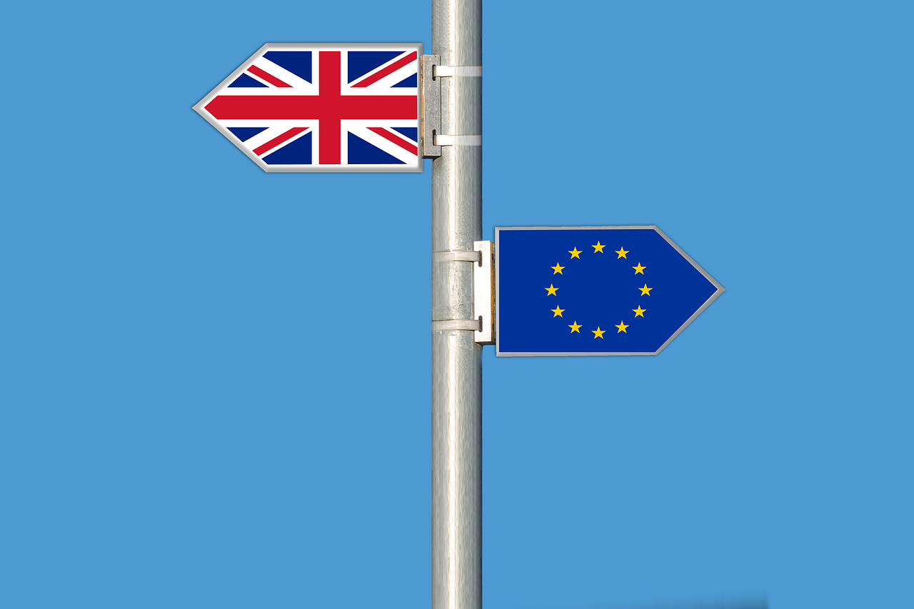
Although the article 50 was triggered and in 2 years time Great Britain will no longer be part of EU; General Data Protection Regulation is still relevant. The new data protection laws ensure the same privacy rights across the EU member states – and regardless of where their data is processed.

Firstly, GDPR is not something that only EU member states should follow but applies to organisations that are not located within the EU but offer goods, services or behaviour monitoring of data subjects in the EU. As a result, everyone who collects and process data of EU citizens must implement the new measures and be able to demonstrate the compliance.

Secondly, the UK government has confirmed that the GDPR regulation will be applied regardless of Brexit.

So, what are the most significant changes?

  • Personal Data definition is more detailed and wider, for example, it includes online identifiers (e.g., IP, cookies). Additionally, personal data that has been pseudonymised also may fall into GDPR. Sensitive personal data now includes biometric and genetic data.
  • Getting a valid consent to process data from the user will be much harder. It will have to be written in easy to understand language and be clear what they will do with that information. The thing to remember is that silence or inactivity doesn’t mean ‘yes’.
  • The user has a right to take his data with him (when moving to competition on closing account).
  • When the data breach occurs, authorities must be informed within 72 hours. It’s already a law in Netherlands – now it will apply everywhere.
  • Privacy Impact Assesment will be mandatory. And it should be done before a project which involves personal information even starts.
  • Some organisations will have to have Data Protection Officer. That depends on a size of the organisation and how much personal data it deals with.
  • Right to be forgotten. There are six conditions under which companies have to remove personal data without delay.
  • Data protection will no longer be a sole responsibility of controllers; it will also be processors responsibility.
  • Data protection by design and by default. Every system will have to be designed with data protection in mind.
  • One stop shop for supervisory authorities in Europe will be introduced. That means that any European data protection authority will be able to take action against company anywhere in the world.
  • All it is enforced with fines of up to €20m or 4% of group annual global turnover.

The fines are high, and the deadlines are short. The regulation comes into effect on 25 May 2018.

The sheer size and diversity of the data stored and processed by many organisations make the challenge a daunting one. In the most simplistic terms, the key implication is that every company must fully understand what personal data it holds. It sounds simple but trust me it’s not. For example, do you even know where and how IP addresses are stored and processed in your organisation? You may find it in various places, stored on web servers, load balancers, proxies, backups, firewalls, IDS/IPS devices, CDNs, various log files, analytics software, advertising, databases, warehouses, data lakes, reporting systems, etc…

There is also a need for organisation-wide data-protection policies, strict access controls, rigorous governance schemes, maintaining auditable records, annual data protection audits. Finally, a rapid detection and reporting of data breaches, and the most important one the ability to find, report, modify or remove personal data on request and within prescribed time limits. Most data processing systems have not been designed to do this. There is rarely a centralised catalogue of all the data stored across all systems. The Big Data mantra used to say “store everything forever” or never delete anything just set a flag “deleted“.

With so many data breaches we need better protection. It’s not an easy task, and there’s a lot of work ahead. What’s important that we all do our best to secure this data.

Because it’s our data and we should care!

Compliance, Security Comments Off on GDPR – Are you ready?
Mar
31

Déjà vu

I had a feeling of déjà vu when I saw this week’s Makeover Monday dashboard.

On the left, you have the Makeover Monday graph (http://visual.ly/secret-success) and on the right a graph from ‘Show me the numbers‘. The latter was used as a sample in the book to demonstrate how not to do visualisations.

I agree with the author that a spider chart is confusing. Often a simple solution like presenting the data in a table works better. I decided to experiment with two simple approaches and prepared a table and a bar chart.

It’s now clear that both visualisations are much more readable than the spider graph.

Which one is better? Well, that’s up to you to decide.

Data Viz Comments Off on Déjà vu
Mar
21

Show me the numbers

If the statistics are boring, then you’ve got the wrong numbers *” or the numbers are shown in the wrong way. I’ve been going through ‘Show me the numbers‘ book by Stephen Few. It’s a very enlightening read on data presentation techniques. The first chapter says that graphs should not be flashy but informative. Graphics need not dominate a presentation, but rather highlight the notable points.

I decided to makeover one of my earlier MakoverMondays dashboards and apply the guidelines.

It was:

…and now, using waffle charts it looks like this:

The waffle chart is nothing more but a square pie chart. I’m aware it’s a bit controversial topic (more on this here), but in some cases provides a nice visual way of communicating percentages.

Charts like these are a form of communication, but the chart must be comprehendible by those you are communicating with, be they senior management, your peers or the general public. In any group, the population is diverse, hence you should strive to appeal to all levels. I feel the second dashboard does the job much better now.

Conclusion: No matter how I show the numbers men are always better off 😉

* Edward R. Tufte

Books, Data Viz Comments Off on Show me the numbers
Mar
15

Am I sexist?

We were riding on a chairlift when my other half noticed that there’s still quite a lot of people out there skiing or snowboarding without a helmet. My first reaction was: “Yes and look, most of them are men!”

But after having a second look (down), I pondered: Is it more men not wearing helmets or is it just because there are fewer women on the slopes?

After a cracking day, going up and down the mountain, that evening I sat down with a glass of wine and did some serious digging. On the SkiClub website I found a consumer research paper on snowsports with some interesting data. SkiClub is the biggest membership-based snowsports club in the UK.

Well, it doesn’t look good – there is indeed fewer women on the slopes, and the numbers are falling. As for the helmets, different sources provide slightly different numbers – from 64% to 88% of people on the slopes ride with a helmet. For this exercise, I settled on the 80% figure which seems representative.

Great, so it looks I’m not sexist after all! Without taking into account other factors (age, gender differences, risk-taking behaviour, etc.), it’s simply because there are more men on the slopes. This makes men more like likely to be spotted without a helmet.

Statistics, Tableau , , , Comments Off on Am I sexist?
Feb
28

Data visualisations with Tableau

I’ve been recently taking part in Makeover Mondays.  It’s an exciting challenge and an excellent way to improve your Tableau skills whenever you have some spare time. The Chicago Taxis challenge was one of the most enjoyable to complete. It offered a live Exasol connection to all 105 million records. The Exasol is an in-memory database, and I must admit it works like a charm with Tableau.

Tableau gives you a nice visual interface for join data sets. It’s very user-friendly especially for beginners and works pretty well compared to other reporting tools I’ve used. tableau1

What’s not so great about Tableau is the way it treats custom SQL. I come from DBA background and can write efficient SQL queries much faster than I can click things on the GUI. Despite the fact that Tableau accepts custom SQL it’s not something recommended and surprisingly tends to be slower to fetch data. I guess that’s due to the way Tableau refactors the query in the background. I noticed that the query is issued inside of a subquery which often leads to poor performance.

Tableau has a pretty good map functionality. It’s great but still slightly limited.  Only the US region has the most detailed built-in maps. But there’s an option to use a custom geocoding, add own map layers should you want to.

The recently released version 10.2  (28 Feb 17)  comes with much improved geo-mapping capabilities. I’m eager to upgrade and take it for a spin.

tableau2

The dashboards are highly interactive and it makes the data presented very visually attractive.

chicago taxis

The only downside of Tableau is that it doesn’t run on Linux and I use Linux as my main desktop.

Data Viz, Tableau Comments Off on Data visualisations with Tableau